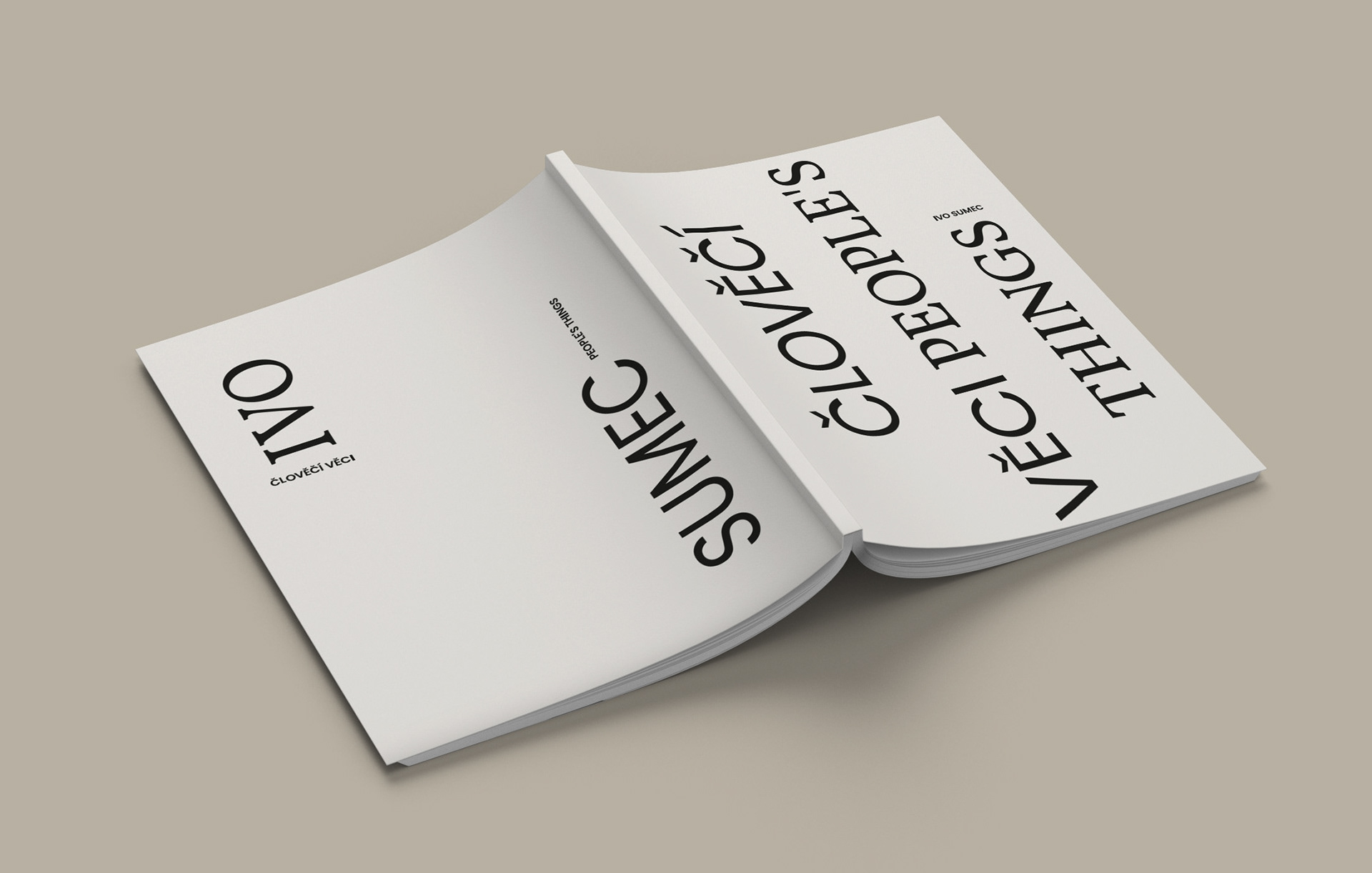
katalog k výstavě Člověčí věci
catalogue design
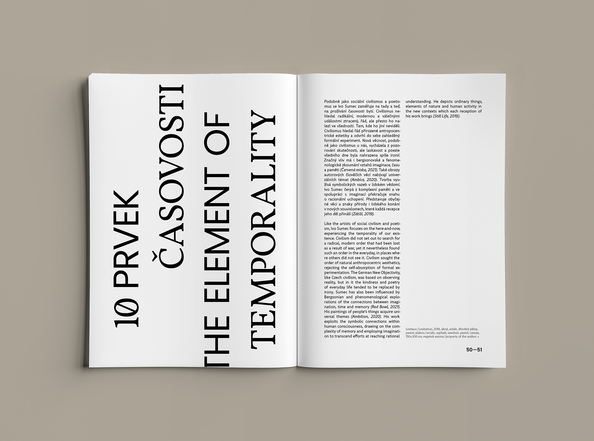
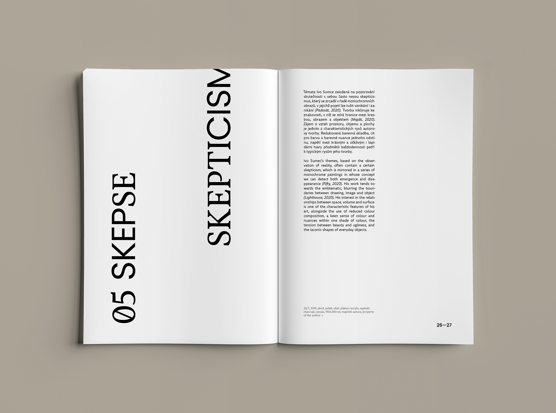
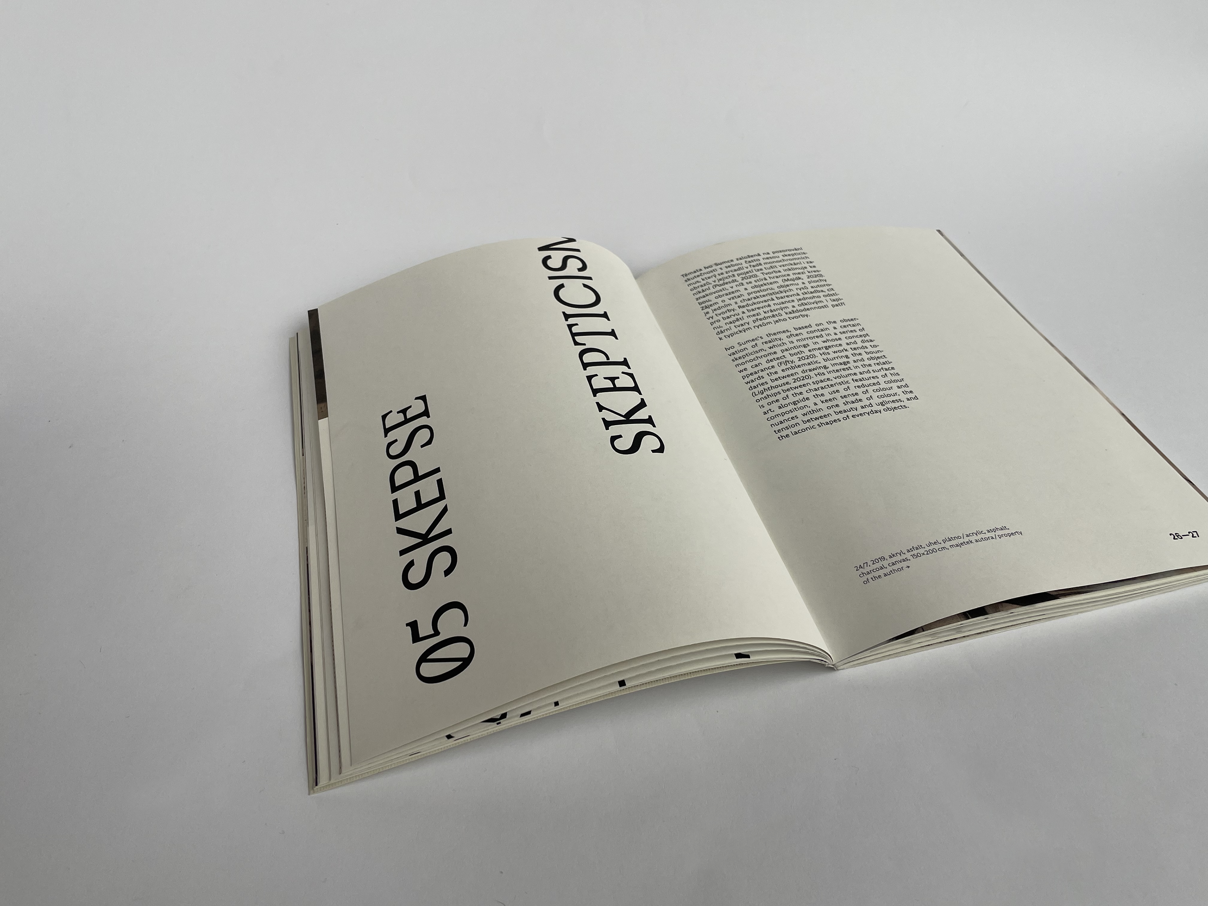
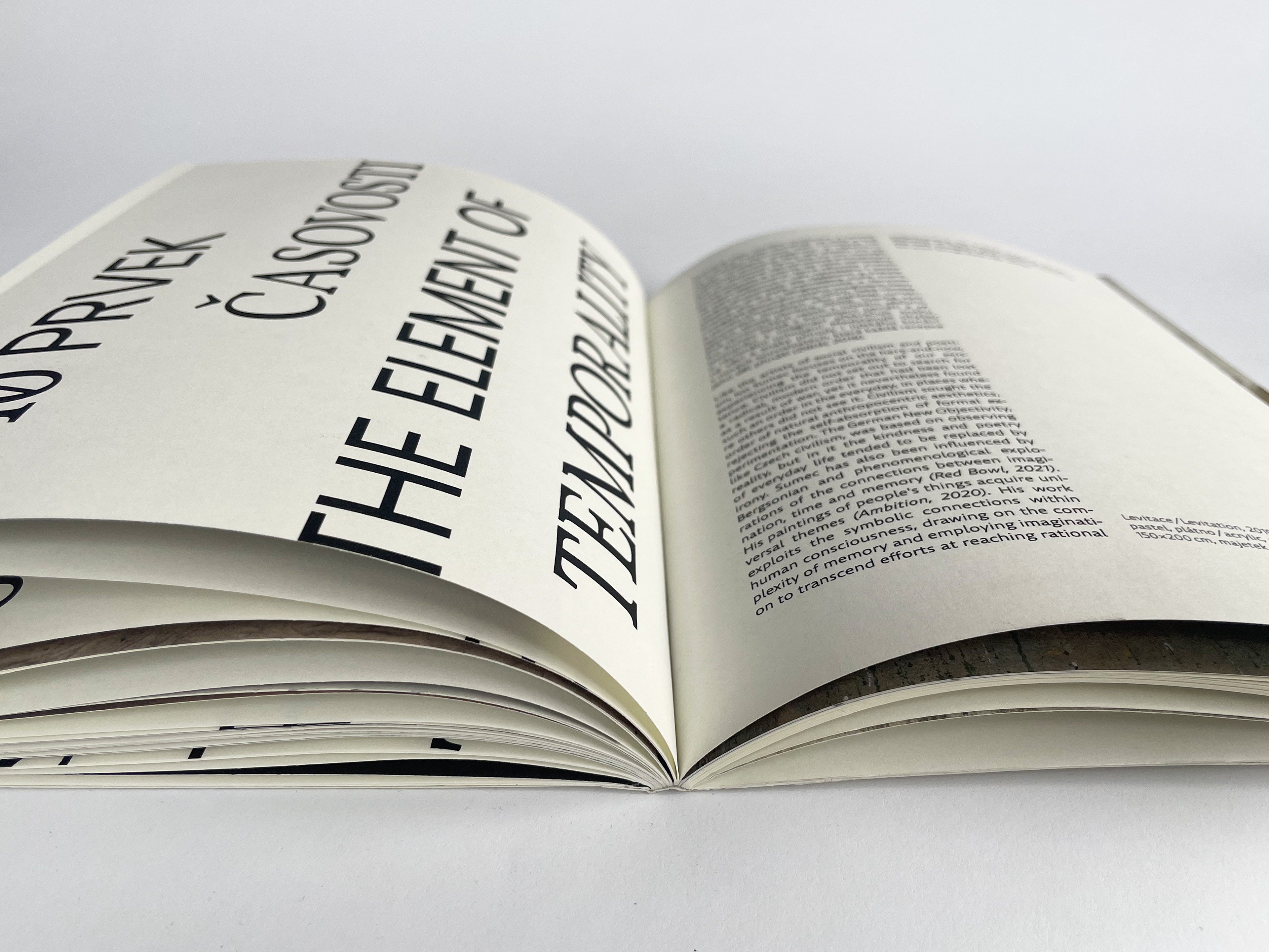
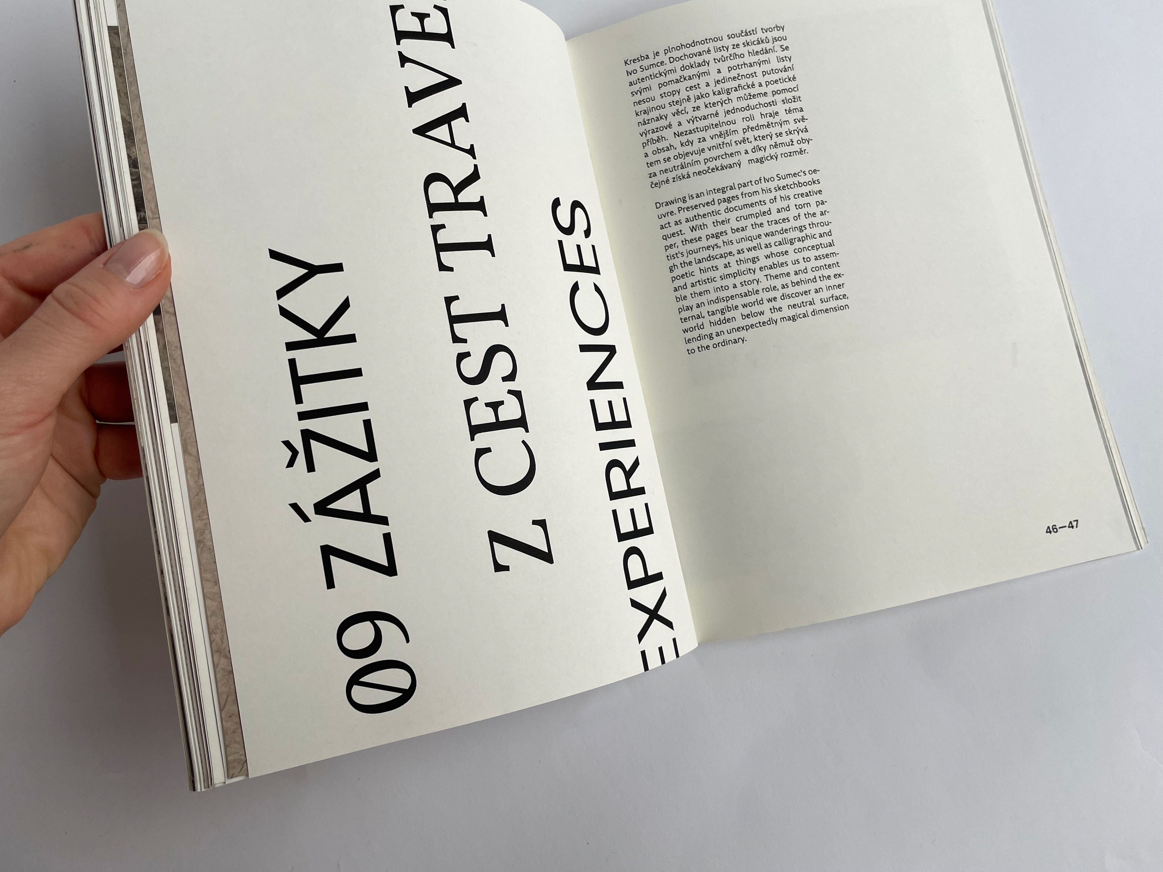
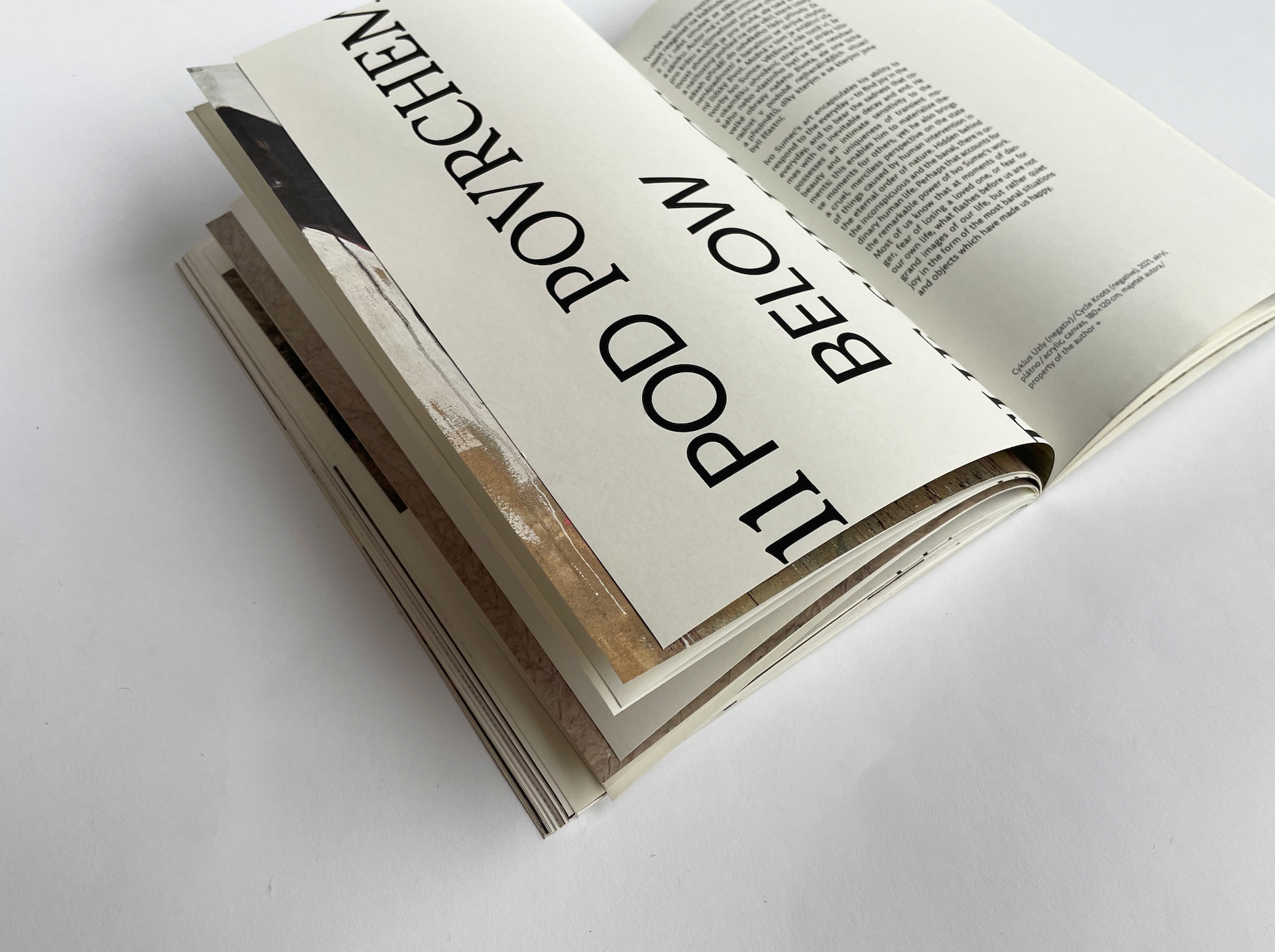
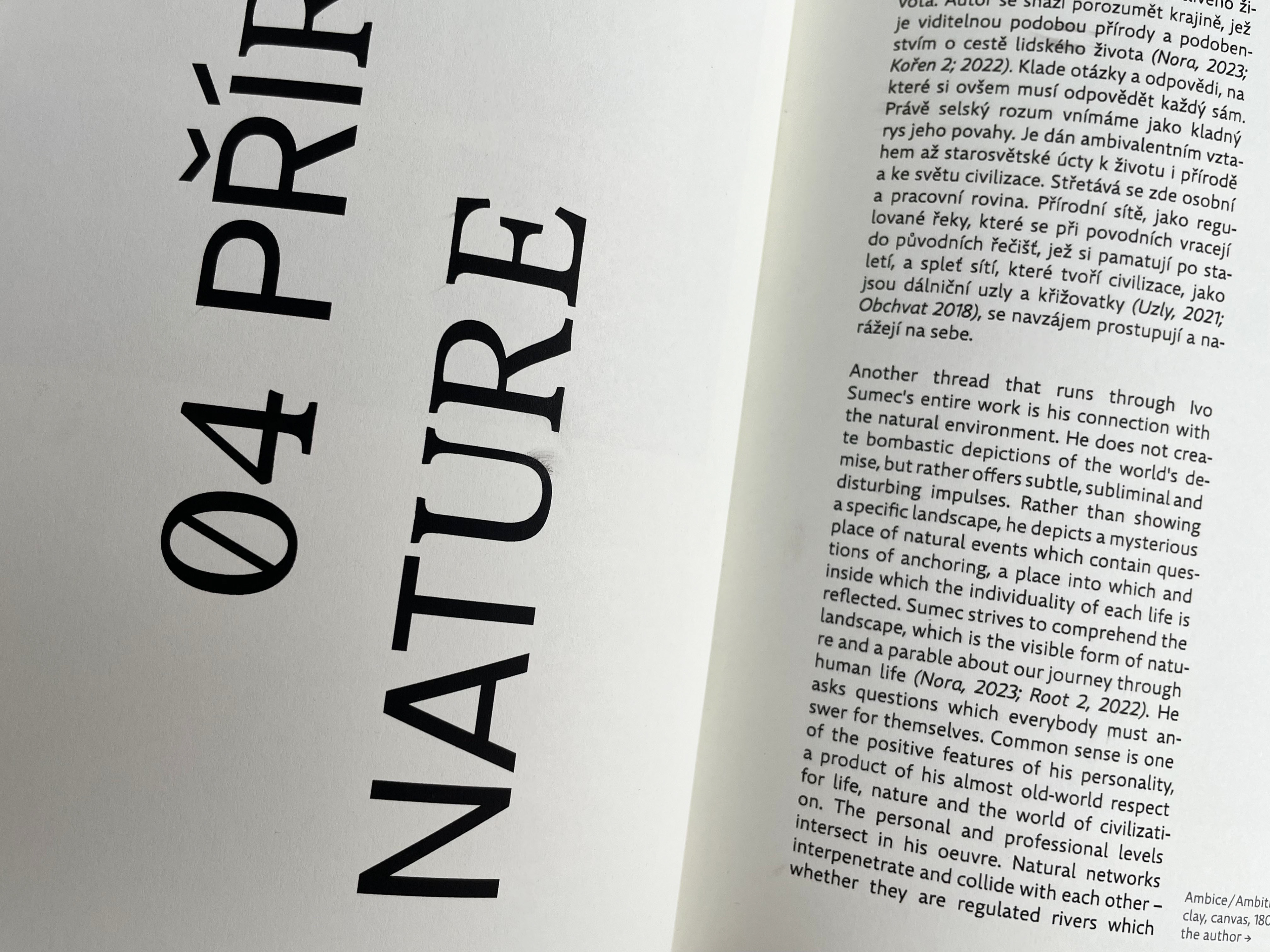
návrh katalogu k výstavě Iva Sumce v Galerii výtvarného umění v Ostravě. grafické řešení je založeno na typografii, konkrétně na kombinaci dvou písem – Vollkorn a Poppins. tato písma jsou použita pro názvy kapitol a umožňují tak divákům rychle pochopit základní principy autorovy tvorby. toto typografické řešení ladí s celkovým vizuálním stylem výstavy.
the catalogue design for the exhibition of painter Ivo Sumec at the Gallery of Fine Arts in Ostrava. the visual is based on typography, specifically the combination of two typefaces – Vollkorn and Poppins. these fonts are used for the chapter titles, allowing viewers to quickly understand the fundamentals of the artist's work. this design choice aligns with the overall visual style of the exhibition.